
The cast courts were grand in every sense of the word. One large tomb was overshadowed by a larger tomb which was overshadowed by an archway which was overshadowed by the facade of a building. I felt like I was in Charles Foster Kane's storage unit in the end of Citizen Kane. Everything looked expensive and I was in awe.
As for educational purposes, obviously the exhibit must be noted for its amazing detail, as plaster can capture those small details. Understanding the specific architecture is worth studying, however, that element was completely overshadowed by the grandness of the whole exhibit. I just wanted to stare at the big things rather than think.
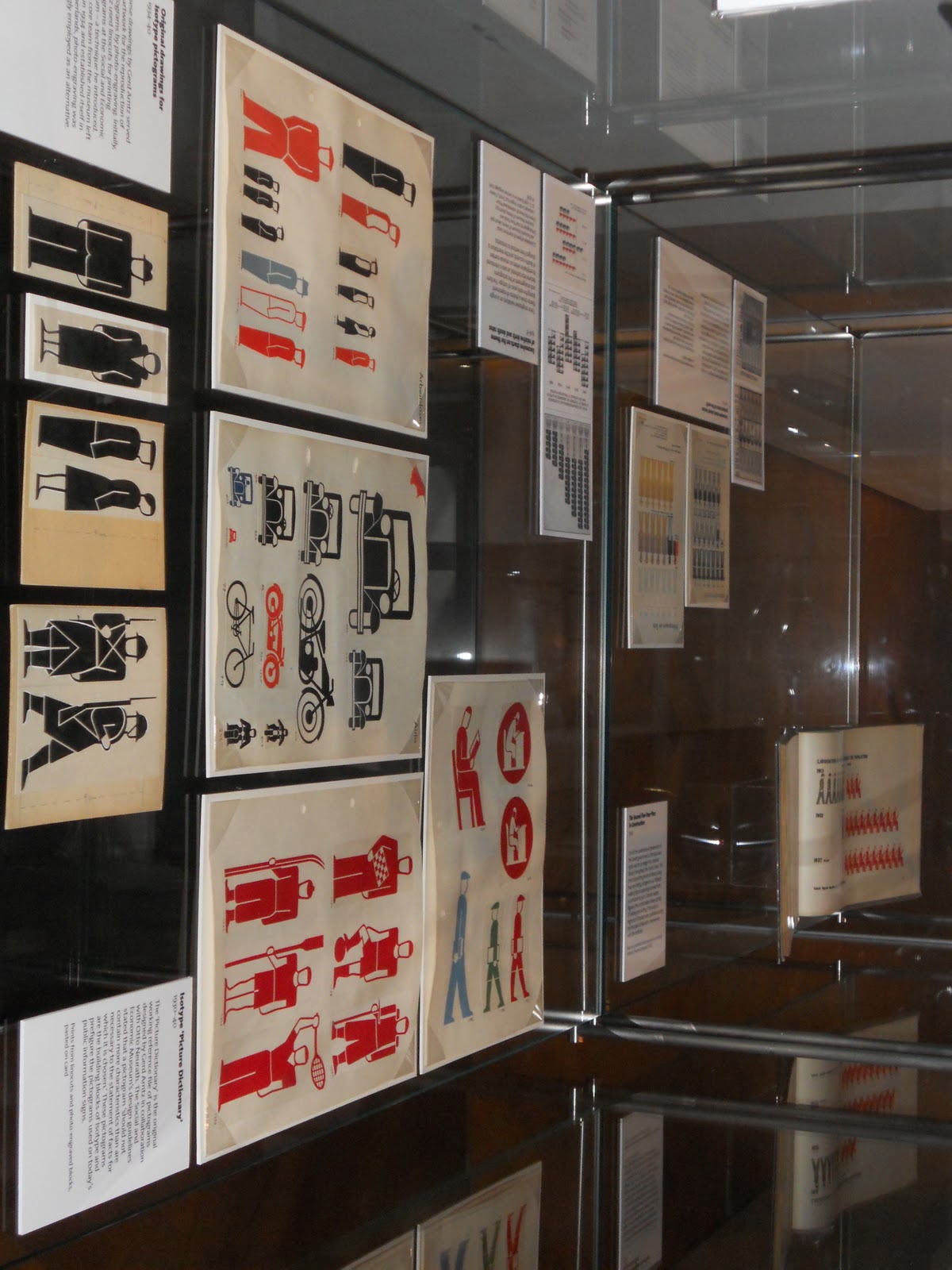
The isotype symbols certainly have more personality than the international symbols, but with more personality comes more detail, more to look at, and more to distinguish from other isotypes. The international symbols are simple only, but isotypes started the movement towards simplicity. What I was most impressed by was the use of graphs with isotypes. I found out that before isotypes, pictographs were uncommon. In this respect, isotypes took a very simple line or bar graph and made it more detailed while adding a new and understandable layer. So many maps, politically or geographically, that one sees on TV include graphics, or half graphics to represent half a quantity. Basically, coming up with the idea that a graphic can represent a quantity is genius, because I can see that Russia has more cheeseburgers than England, so therefor Russia has more of the cheeseburger fact I want to know about. Also, isotypes were clearly the inspiration for the international symbols, creating a movement that pushed away from only text, or text at all. It felt odd in the museum at first, but as a key inspiration to the international symbols which are everywhere, it certainly cemented it as a decorative art.


These two patterns represent a more traditional cell versus a modern cell. The carpeting has bright colors, and each cell has a not-perfectly shaped football with a circle outside of it. The iron gate has a circle with an x inside and outside it. Obviously the iron gate is only black. Also, the carpeting has each cell repeating through the window of the other layer, as in they are off one to each other, while the iron gate repeats in a row and column perfectly. They seem different, but the sense of repeating cells, and in this case, circular cells, shows new inspiring old and artwork taking each other into account. It's almost as thought the two completely different types of art are speaking to each other.


The Madison Bus routes are very cluttered with geography. While this may be helpful to some, it distracts from the actual routes and how and where they intersect. No one is looking at a Madison map and specifically pointing at an area and saying, "I need to get there." Basically London's tube map forgets correct map scale but accurately shows how to get from one stop to another. London's whole transport system is much more thought out than Madison's.

This chandelier was my favorite piece in the museum. Unfortunately it didn't belong to any collection besides the lobby, but I stood and looked at it for a large amount of time and from many different angles. I also liked the Wisconsin connection from the artist. I marvel at the amount of preparation that went into planning this piece. Did the artist sketch every piece individually or improvise as he went along? I would certainly visit the V and A again just to get every detail and every angle of this beautiful work of art.
No comments:
Post a Comment