This logo does not seem to fit the feel of the museum. First of all, why are the two words in different fonts? I know the Tate is a chain of museums with a consistent "Tate" font, but the word "Britain" is unnecessarily standing out, especially because it is very clear compared to "Tate" which disintegrates and fades in and out. The two do not compliment each other at all. Further, the fading and disintegrating seem very modern if not scary. While the Coral Reef display may have fit that description, the rest of the museum has classical painting with classic displays. Even the building is classic and sits on the river Thames. The logo instills a creepy feeling but the museum has very little presence of that feeling.
In the painting, a noticeably distressed Ophelia drowns in a brook surrounded by flowers and green. While she may be distressed and crazy, she is at peace with nature in this painting. In the play we saw at the National Theatre, Ophelia, while still crazy, is kidnapped and murdered by the Orwellian police force. She is never at peace in the play. It certainly contrasts with the message of the picture: a peaceful death. As another note, I don't remember seeing any green in the play at all. Everything was urban and completely detached from the natural world, as if they were locked up in this tower of a politically tensioned society. As I keep talking aloud, Egypt suddenly comes to mind to fit the production of Hamlet we saw. I guess Shakespeare is relevant even without being "modernized".
I want to murder this painting. Seriously, just take lighter fluid and douse this sucker. I have a love hate relationship with modern art; I love to hate it. And this painting nearly epitomizes my hatred. Its a brown canvas with a stupid rectangle that's three different colors. I can do that, but my art isn't in a stupid art museum. However, because of the odd style of painting, they need to be taken alone, almost isolated from other paintings. It certainly enhances the "effect" of the paintings, whatever the effect of this one may be.
These types of painting, a more traditional type, are hung in groups because they compliment each other. While each painting is individual, its style matches with others around it. This painting by Thomas Gainsborough feels the same as the other paintings in the gallery. They aren't as utterly unique in subject and feel like the modern ones. This is why they can be hung gallery style.
I was a fan of the TV show Lost, and this exhibit reminded me of the hatch they found. Someone was surviving in there, and not just living, but surviving in an isolated state. The clown mask actually made me jump as I walked in. The whole exhibit kept me on my toes, and I kept figuring it to a haunted house, thinking someone was going to jump out and kill me. The lighting was dim or dark, which certainly added to the creepiness. The time I was most confused was in the last room where it was the "construction room", where they had all the materials used to make the exhibit. At first, I thought i had walked into a room I wasn't allowed to be in, especially because there was a guard in there. I couldn't understand what was happening, but showing the "process" didn't make it less real but only scarier. It was a "House of Wax" type exhibit.
I am a more traditional museum visitor. I like paintings on walls and the occasional object gallery. Usually at museums in the States I'll skip over the rugs section, so in that respect, I enjoyed the Tate Britain more than the V&A. The Tate was a pretty perfect museum in my opinion. It was located right on the Thames with a beautiful view out every window. It had traditional pictures, modern art, and the craziest exhibit I've ever seen: The Coral Reefs. When I go to an Art Museum, the Tate Britain describes perfectly what I imagine an art museum to be.
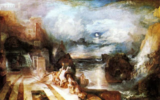
My favorite panting was The Parting of Hero and Leander by Joseph Mallord William Turner from 1837. I was completely engulfed in this painting for about a half an hour. The contrast between the land and sea and sky were compelling. It was very interesting in the transitions between the three, as the colors gradually transformed into one, and there was rarely a defined ending to anything. The land area is interesting to look at, because this city is almost heavenly in the sky. Overall, I would love to look at other paintings and compare them to this one, but really just take another look at the complexity of color in this painting.


No comments:
Post a Comment