I dont know why there is more than one logo. The blurring makes it recognizable, but the fact that it isn't consistent make me annoyed. This class has certainly made me more critical of museum presentation, and my advertising degree is teaching me about branding. No matter how similar the logos may be, they are contrasting and that is off putting in my opinion. However, I like the consistency of Modern in the upper right corner.

Part of the reason I wanted to study abroad in London was the free museum admissions. While the term "cultural elite" has taken on a negative connotation lately, being cultured will never be a bad thing. I think many people in London are more cultured than those in America, or even in the bigger cities. Museums are both educational and historically important. More people should see art and history. I think London has it right; if more people in America were able to visit museums, they would be a bit more cultured and willing to engage in discussion.
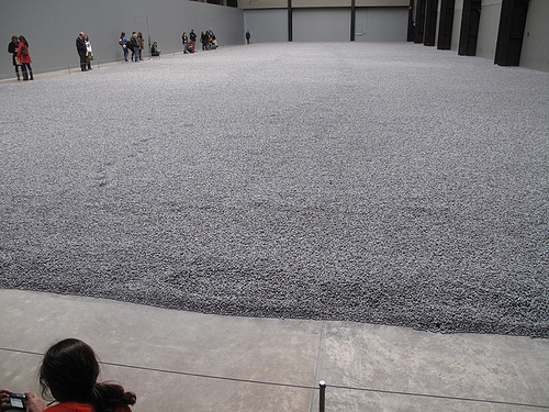
Why do they look like sunflower seeds? Why are they just sitting on the floor like that? Why are there so many? What's the point? How can this be art?
These are frequent questions I ask myself while in modern art museums. And this specific exhibit made me ask even more questions. I appreciate the sheer vastness of the piece, and the time put into each porcelain object must have been tedious, but I still don't get it. I think the fact that we could not stand on the seeds, like it was meant to be presented, did take away from the piece. If it was meant to be interactive art, but we were not allowed to interact, then the point diminishes.
If the point of the piece was about individuality, I respect that. But again, we weren't able to see any pieces individually, only as a whole. If we were allowed on the seeds, then the one vs a group mentality may have been more emphasized. This was just a group.

To be honest, I think some color would add flavor to the galleries. Maybe the galleries with more three dimensional pieces should still have white walls, but white is a very ordinary color for art museums. Classical paintings seem to have you focus on the painting only, but modern art transcends the canvas, and a white wall is much more boring than one with a little color. Modern art is a feeling or an experience rather than just a picture, which sometimes classical paintings can be restricted to. As the Modern Art museum, The Tate can certainly do a better job modernizing their galleries.
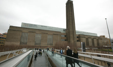
I think one of the coolest attributes of the museum is it's exterior. Modern does not mean the new, slick, technology driven world. Really, one could argue the modern world began with electricity, when people were no longer in the dark. The power station is a symbol of modernization. Again, it's not sleek, but it does not need to be. It feels like a warehouse. Architecturally, it separates itself from the classical and beautiful looking older buildings of London. It's from the manufacturing age, and I think it adds to the modern sense of the museum without being technology driven. Its certainly modern in relation to the age of the city of London.

My favorite piece in this museum was Metamorphosis of Narcissus by Salvador Dali from 1937. The absurdism, almost three dimensional feel of the piece is completely engaging. The chess board and weird rock shapes that may be legs and the pool and canyon all contrast each other so oddly, I would walk to see this painting again. An interesting observation: The sky doesn't really match on the two sides of the painting. For these observations, taking in the whole surreal atmosphere of Dali's vision, I would love to see this painting again.
No comments:
Post a Comment