Sunday, February 20, 2011

The National Gallery


I don't think this qualifies as a logo, however the typeface is very interesting, with heightened serifs. I think the L's stand out with the angled serifs, and the R in Gallery has the extended serif, which gives it a very classy and posh feel. The museum is the most traditional of the museums we've visited, its a traditional art gallery, so I feel like not only the typeface, but the actual words are the logo to the museum. It is where to find classical art. The whole package symbolizes the museum more accurately than a logo or one picture can. I love the typeface and prefer this to anything else. 


I visited the Van Gogh museum in Amsterdam and I was blown away at the beauty of his work. I have always known Van Gogh is the pinnacle of art for 20th century influence, but I had only seen a few of his paintings in person. To be completely consumed by his work in the museum was riveting. His use of line developed. I always enjoy the short and thin line pictures, like the Sunflower picture, and how all these lines are essentially equal in everything minus color, and create this masterpiece. The Sunflower picture in particular, rising above its fame, is a source of happiness. Van Gogh had yellow represent happiness to him, and in this simple still life, I am certainly happy. At first glance, it looks like a seven year old drew this, its fairly juvenile, the lines aren't perfectly straight, but the different shades of yellow and gold draw a smile out from me every time. I've seen Starry Night and been blown away by its beauty (I think blues are stunning), so in my opinion, Van Gogh rightfully earns his place in art history.

I appreciated the wall panel design at the National Gallery. I haven't developed a solid opinion on whether I prefer blank walls or patterned or colored, but this enhanced my experience. I dont think my appreciation of the specific painting were increased, but when I walked into a new gallery, I think the ambiance of the room was incredible. I loved one room with blue wallpaper and few paintings over each other, so the whole wall was covered. The room itself looked like art.


When I visited the National Gallery in 2006, I bought a poster-painting of Monet's foggy London painting, and it has hung in my room ever since. I love looking at it, mostly because it reminds me of London and that trip and the museum. Obviously it doesn't capture the beauty of the actual piece, but it's still a fantastic piece of nostalgia. I'm honestly surprising myself by saying this, because at first thought, I hated that they'd try and recreate or sell knockoffs of the beautiful paintings. But thinking about my poster-painting from home, I really have to contradict myself. It is a fantastic souvenir that reminds someone of the beautiful painting and of the great trip to London. It's worth "profiteering" like that, solely because it brings me, and I assume others, happiness.


On the left is my piece of desire and on the right is my piece of appreciation. I love how later in his life, Monet essentially recreated the famous Japanese bridge in a more abstract sense, really using color to emphasize the water. If anything, the bridge is apart of nature, and looking at Monet's other water Lilly paintings, he certainly believes that whole area to be serene and all beautiful, so it makes sense that the bridge is part of its surroundings. The color emphasized here is turquoise, which is a nice blend of green and blue, or of land and water. This painting reminds me of Avatar, to be honest. The illuminating plant life and nature on Pandora is exotic and almost hallucinogenic. This painting reminds me of that. I also love how Monet hardly ever uses blue to paint water. It's full of pink and green and yellow, completely distorting the scene around the water. It's stunning. 

The more traditional but still very surreal Japanese Bridge painting is the one that belongs in my house. There will be a room with all white walls (or that blue wallpaper) and a chair for me to sit in and look at the painting. Always with Monet, I am fascinated with his water. I look up close to see what odd colors he included in the water, and then stand back to see it as one whole unit. The scene itself is a place I'd love to read a book or think, sitting on the grass looking at the bridge and the bank. I really hope to visit this area in France and just take it all in, like I'm in a Monet painting. 

Sunday, February 13, 2011

Tate Modern

I dont know why there is more than one logo. The blurring makes it recognizable, but the fact that it isn't consistent make me annoyed. This class has certainly made me more critical of museum presentation, and my advertising degree is teaching me about branding. No matter how similar the logos may be, they are contrasting and that is off putting in my opinion. However, I like the consistency of Modern in the upper right corner. 


Part of the reason I wanted to study abroad in London was the free museum admissions. While the term "cultural elite" has taken on a negative connotation lately, being cultured will never be a bad thing. I think many people in London are more cultured than those in America, or even in the bigger cities. Museums are both educational and historically important. More people should see art and history. I think London has it right; if more people in America were able to visit museums, they would be a bit more cultured and willing to engage in discussion. 


Why do they look like sunflower seeds? Why are they just sitting on the floor like that? Why are there so many? What's the point? How can this be art?

These are frequent questions I ask myself while in modern art museums. And this specific exhibit made me ask even more questions. I appreciate the sheer vastness of the piece, and the time put into each porcelain object must have been tedious, but I still don't get it. I think the fact that we could not stand on the seeds, like it was meant to be presented, did take away from the piece. If it was meant to be interactive art, but we were not allowed to interact, then the point diminishes. 

If the point of the piece was about individuality, I respect that. But again, we weren't able to see any pieces individually, only as a whole. If we were allowed on the seeds, then the one vs a group mentality may have been more emphasized. This was just a group.


To be honest, I think some color would add flavor to the galleries. Maybe the galleries with more three dimensional pieces should still have white walls, but white is a very ordinary color for art museums. Classical paintings seem to have you focus on the painting only, but modern art transcends the canvas, and a white wall is much more boring than one with a little color. Modern art is a feeling or an experience rather than just a picture, which sometimes classical paintings can be restricted to. As the Modern Art museum, The Tate can certainly do a better job modernizing their galleries. 


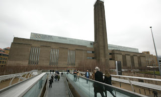
I think one of the coolest attributes of the museum is it's exterior. Modern does not mean the new, slick, technology driven world. Really, one could argue the modern world began with electricity, when people were no longer in the dark. The power station is a symbol of modernization. Again, it's not sleek, but it does not need to be. It feels like a warehouse. Architecturally, it separates itself from the classical and beautiful looking older buildings of London. It's from the manufacturing age, and I think it adds to the modern sense of the museum without being technology driven. Its certainly modern in relation to the age of the city of London.


My favorite piece in this museum was Metamorphosis of Narcissus by Salvador Dali from 1937. The absurdism, almost three dimensional feel of the piece is completely engaging. The chess board and weird rock shapes that may be legs and the pool and canyon all contrast each other so oddly, I would walk to see this painting again. An interesting observation: The sky doesn't really match on the two sides of the painting. For these observations, taking in the whole surreal atmosphere of Dali's vision, I would love to see this painting again. 


Sunday, February 6, 2011

Tate Britain


This logo does not seem to fit the feel of the museum. First of all, why are the two words in different fonts? I know the Tate is a chain of museums with a consistent "Tate" font, but the word "Britain" is unnecessarily standing out, especially because it is very clear compared to "Tate" which disintegrates and fades in and out. The two do not compliment each other at all. Further, the fading and disintegrating seem very modern if not scary. While the Coral Reef display may have fit that description, the rest of the museum has classical painting with classic displays. Even the building is classic and sits on the river Thames. The logo instills a creepy feeling but the museum has very little presence of that feeling. 


In the painting, a noticeably distressed Ophelia drowns in a brook surrounded by flowers and green. While she may be distressed and crazy, she is at peace with nature in this painting. In the play we saw at the National Theatre, Ophelia, while still crazy, is kidnapped and murdered by the Orwellian police force. She is never at peace in the play. It certainly contrasts with the message of the picture: a peaceful death. As another note, I don't remember seeing any green in the play at all. Everything was urban and completely detached from the natural world, as if they were locked up in this tower of a politically tensioned society. As I keep talking aloud, Egypt suddenly comes to mind to fit the production of Hamlet we saw. I guess Shakespeare is relevant even without being "modernized".


I want to murder this painting. Seriously, just take lighter fluid and douse this sucker. I have a love hate relationship with modern art; I love to hate it. And this painting nearly epitomizes my hatred. Its a brown canvas with a stupid rectangle that's three different colors. I can do that, but my art isn't in a stupid art museum. However, because of the odd style of painting, they need to be taken alone, almost isolated from other paintings. It certainly enhances the "effect" of the paintings, whatever the effect of this one may be. 


These types of painting, a more traditional type, are hung in groups because they compliment each other. While each painting is individual, its style matches with others around it. This painting by Thomas Gainsborough feels the same as the other paintings in the gallery. They aren't as utterly unique in subject and feel like the modern ones. This is why they can be hung gallery style.


I was a fan of the TV show Lost, and this exhibit reminded me of the hatch they found. Someone was surviving in there, and not just living, but surviving in an isolated state. The clown mask actually made me jump as I walked in. The whole exhibit kept me on my toes, and I kept figuring it to a haunted house, thinking someone was going to jump out and kill me. The lighting was dim or dark, which certainly added to the creepiness. The time I was most confused was in the last room where it was the "construction room", where they had all the materials used to make the exhibit. At first, I thought i had walked into a room I wasn't allowed to be in, especially because there was a guard in there. I couldn't understand what was happening, but showing the "process" didn't make it less real but only scarier. It was a "House of Wax" type exhibit. 

I am a more traditional museum visitor. I like paintings on walls and the occasional object gallery. Usually at museums in the States I'll skip over the rugs section, so in that respect, I enjoyed the Tate Britain more than the V&A. The Tate was a pretty perfect museum in my opinion. It was located right on the Thames with a beautiful view out every window. It had traditional pictures, modern art, and the craziest exhibit I've ever seen: The Coral Reefs. When I go to an Art Museum, the Tate Britain describes perfectly what I imagine an art museum to be.


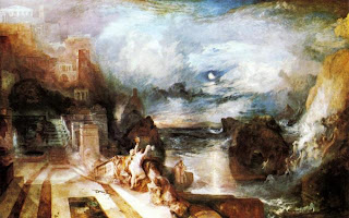
My favorite panting was The Parting of Hero and Leander by Joseph Mallord William Turner from 1837. I was completely engulfed in this painting for about a half an hour. The contrast between the land and sea and sky were compelling. It was very interesting in the transitions between the three, as the colors gradually transformed into one, and there was rarely a defined ending to anything. The land area is interesting to look at, because this city is almost heavenly in the sky. Overall, I would love to look at other paintings and compare them to this one, but really just take another look at the complexity of color in this painting.