Sunday, February 13, 2011

Tate Modern

I dont know why there is more than one logo. The blurring makes it recognizable, but the fact that it isn't consistent make me annoyed. This class has certainly made me more critical of museum presentation, and my advertising degree is teaching me about branding. No matter how similar the logos may be, they are contrasting and that is off putting in my opinion. However, I like the consistency of Modern in the upper right corner. 


Part of the reason I wanted to study abroad in London was the free museum admissions. While the term "cultural elite" has taken on a negative connotation lately, being cultured will never be a bad thing. I think many people in London are more cultured than those in America, or even in the bigger cities. Museums are both educational and historically important. More people should see art and history. I think London has it right; if more people in America were able to visit museums, they would be a bit more cultured and willing to engage in discussion. 
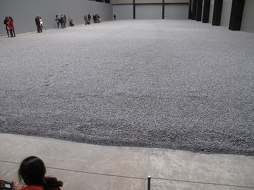

Why do they look like sunflower seeds? Why are they just sitting on the floor like that? Why are there so many? What's the point? How can this be art?

These are frequent questions I ask myself while in modern art museums. And this specific exhibit made me ask even more questions. I appreciate the sheer vastness of the piece, and the time put into each porcelain object must have been tedious, but I still don't get it. I think the fact that we could not stand on the seeds, like it was meant to be presented, did take away from the piece. If it was meant to be interactive art, but we were not allowed to interact, then the point diminishes. 

If the point of the piece was about individuality, I respect that. But again, we weren't able to see any pieces individually, only as a whole. If we were allowed on the seeds, then the one vs a group mentality may have been more emphasized. This was just a group.


To be honest, I think some color would add flavor to the galleries. Maybe the galleries with more three dimensional pieces should still have white walls, but white is a very ordinary color for art museums. Classical paintings seem to have you focus on the painting only, but modern art transcends the canvas, and a white wall is much more boring than one with a little color. Modern art is a feeling or an experience rather than just a picture, which sometimes classical paintings can be restricted to. As the Modern Art museum, The Tate can certainly do a better job modernizing their galleries. 
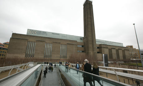

I think one of the coolest attributes of the museum is it's exterior. Modern does not mean the new, slick, technology driven world. Really, one could argue the modern world began with electricity, when people were no longer in the dark. The power station is a symbol of modernization. Again, it's not sleek, but it does not need to be. It feels like a warehouse. Architecturally, it separates itself from the classical and beautiful looking older buildings of London. It's from the manufacturing age, and I think it adds to the modern sense of the museum without being technology driven. Its certainly modern in relation to the age of the city of London.


My favorite piece in this museum was Metamorphosis of Narcissus by Salvador Dali from 1937. The absurdism, almost three dimensional feel of the piece is completely engaging. The chess board and weird rock shapes that may be legs and the pool and canyon all contrast each other so oddly, I would walk to see this painting again. An interesting observation: The sky doesn't really match on the two sides of the painting. For these observations, taking in the whole surreal atmosphere of Dali's vision, I would love to see this painting again. 


Sunday, February 6, 2011

Tate Britain


This logo does not seem to fit the feel of the museum. First of all, why are the two words in different fonts? I know the Tate is a chain of museums with a consistent "Tate" font, but the word "Britain" is unnecessarily standing out, especially because it is very clear compared to "Tate" which disintegrates and fades in and out. The two do not compliment each other at all. Further, the fading and disintegrating seem very modern if not scary. While the Coral Reef display may have fit that description, the rest of the museum has classical painting with classic displays. Even the building is classic and sits on the river Thames. The logo instills a creepy feeling but the museum has very little presence of that feeling. 


In the painting, a noticeably distressed Ophelia drowns in a brook surrounded by flowers and green. While she may be distressed and crazy, she is at peace with nature in this painting. In the play we saw at the National Theatre, Ophelia, while still crazy, is kidnapped and murdered by the Orwellian police force. She is never at peace in the play. It certainly contrasts with the message of the picture: a peaceful death. As another note, I don't remember seeing any green in the play at all. Everything was urban and completely detached from the natural world, as if they were locked up in this tower of a politically tensioned society. As I keep talking aloud, Egypt suddenly comes to mind to fit the production of Hamlet we saw. I guess Shakespeare is relevant even without being "modernized".


I want to murder this painting. Seriously, just take lighter fluid and douse this sucker. I have a love hate relationship with modern art; I love to hate it. And this painting nearly epitomizes my hatred. Its a brown canvas with a stupid rectangle that's three different colors. I can do that, but my art isn't in a stupid art museum. However, because of the odd style of painting, they need to be taken alone, almost isolated from other paintings. It certainly enhances the "effect" of the paintings, whatever the effect of this one may be. 


These types of painting, a more traditional type, are hung in groups because they compliment each other. While each painting is individual, its style matches with others around it. This painting by Thomas Gainsborough feels the same as the other paintings in the gallery. They aren't as utterly unique in subject and feel like the modern ones. This is why they can be hung gallery style.


I was a fan of the TV show Lost, and this exhibit reminded me of the hatch they found. Someone was surviving in there, and not just living, but surviving in an isolated state. The clown mask actually made me jump as I walked in. The whole exhibit kept me on my toes, and I kept figuring it to a haunted house, thinking someone was going to jump out and kill me. The lighting was dim or dark, which certainly added to the creepiness. The time I was most confused was in the last room where it was the "construction room", where they had all the materials used to make the exhibit. At first, I thought i had walked into a room I wasn't allowed to be in, especially because there was a guard in there. I couldn't understand what was happening, but showing the "process" didn't make it less real but only scarier. It was a "House of Wax" type exhibit. 

I am a more traditional museum visitor. I like paintings on walls and the occasional object gallery. Usually at museums in the States I'll skip over the rugs section, so in that respect, I enjoyed the Tate Britain more than the V&A. The Tate was a pretty perfect museum in my opinion. It was located right on the Thames with a beautiful view out every window. It had traditional pictures, modern art, and the craziest exhibit I've ever seen: The Coral Reefs. When I go to an Art Museum, the Tate Britain describes perfectly what I imagine an art museum to be.


My favorite panting was The Parting of Hero and Leander by Joseph Mallord William Turner from 1837. I was completely engulfed in this painting for about a half an hour. The contrast between the land and sea and sky were compelling. It was very interesting in the transitions between the three, as the colors gradually transformed into one, and there was rarely a defined ending to anything. The land area is interesting to look at, because this city is almost heavenly in the sky. Overall, I would love to look at other paintings and compare them to this one, but really just take another look at the complexity of color in this painting. 

Monday, January 31, 2011

Victoria and Albert (What the happy couple)


I believe this logo accurately captures the Victoria and Albert. The contrast between the thick and thin lines in the V and the ampersand. The serif's add an element of history and class to the logo which feels right because most of the artwork is historical rather than modern. If the museum was more full of modern exhibits, a font without serif's life helvetica would seem more appropriate. The consistency between the left branch of the V and the right branch of the A is very nice. In a way, the logo feels symmetrical, although it isn't. This symmetrical or patterned feel of the logo is reminiscent of the iron gates in the museum. Each had a distinct number of cells that were repeated, and the logo gives off the feeling of two cells where one has rotated and flipped over. It is a strong move to remind visitors of an exhibit while planning a logo, especially as this does it subtly rather than blatantly.


The cast courts were grand in every sense of the word. One large tomb was overshadowed by a larger tomb which was overshadowed by an archway which was overshadowed by the facade of a building. I felt like I was in Charles Foster Kane's storage unit in the end of Citizen Kane. Everything looked expensive and I was in awe. 
As for educational purposes, obviously the exhibit must be noted for its amazing detail, as plaster can capture those small details. Understanding the specific architecture is worth studying, however, that element was completely overshadowed by the grandness of the whole exhibit. I just wanted to stare at the big things rather than think. 


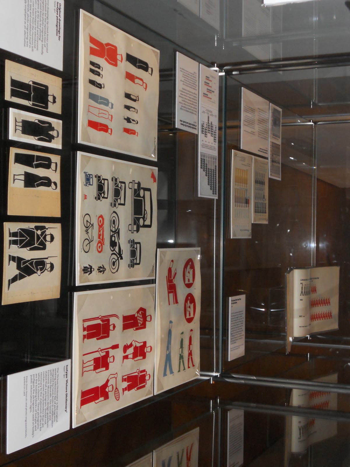
The isotype symbols certainly have more personality than the international symbols, but with more personality comes more detail, more to look at, and more to distinguish from other isotypes. The international symbols are simple only, but isotypes started the movement towards simplicity. What I was most impressed by was the use of graphs with isotypes. I found out that before isotypes, pictographs were uncommon. In this respect, isotypes took a very simple line or bar graph and made it more detailed while adding a new and understandable layer. So many maps, politically or geographically, that one sees on TV include graphics, or half graphics to represent half a quantity. Basically, coming up with the idea that a graphic can represent a quantity is genius, because I can see that Russia has more cheeseburgers than England, so therefor Russia has more of the cheeseburger fact I want to know about. Also, isotypes were clearly the inspiration for the international symbols, creating a movement that pushed away from only text, or text at all. It felt odd in the museum at first, but as a key inspiration to the international symbols which are everywhere, it certainly cemented it as a decorative art.


These two patterns represent a more traditional cell versus a modern cell. The carpeting has bright colors, and each cell has a not-perfectly shaped football with a circle outside of it. The iron gate has a circle with an x inside and outside it. Obviously the iron gate is only black. Also, the carpeting has each cell repeating through the window of the other layer, as in they are off one to each other, while the iron gate repeats in a row and column perfectly. They seem different, but the sense of repeating cells, and in this case, circular cells, shows new inspiring old and artwork taking each other into account. It's almost as thought the two completely different types of art are speaking to each other.


 The London Underground has much more personality in the logo than Madison's Metro. For one, the underground tells people exactly what it is. It is a tunnel underground. The perfect O shape in the font is repeated as the logo as well. There is perfect contrast and simplicity to the logo, as it is also very recognizable. The color scheme works well together. I am a Chicago Cubs fan so nothing beats blue and red. The Madison Metro logo does not explain what it is like the tube. It is italicized with three different colors and white text. No where does it infer a transportation system like a picture of a bus. The London logo, while also not having a picture, allows one to infer that anything underground is probably transportation, and Metro does not necessarily mean transport.


The Madison Bus routes are very cluttered with geography. While this may be helpful to some, it distracts from the actual routes and how and where they intersect. No one is looking at a Madison map and specifically pointing at an area and saying, "I need to get there." Basically London's tube map forgets correct map scale but accurately shows how to get from one stop to another. London's whole transport system is much more thought out than Madison's.


This chandelier was my favorite piece in the museum. Unfortunately it didn't belong to any collection besides the lobby, but I stood and looked at it for a large amount of time and from many different angles. I also liked the Wisconsin connection from the artist. I marvel at the amount of preparation that went into planning this piece. Did the artist sketch every piece individually or improvise as he went along? I would certainly visit the V and A again just to get every detail and every angle of this beautiful work of art.

Monday, January 24, 2011

Science Museum


The logo of the Science Museum accurately describes half of the museum. The logo feels digital and futuristic. It gives off a binary-computer feel with the straight lines and angles. I really appreciate the symmetry and consistency among the letters. Every letter has the same shell, the three outer lines, and those are rotated to make the letters. M's and E's are the same, as are C's and U's. The I is very interesting, as it blends in at first glance, but uniquely, they've separated it. While it is lowercase and the other letters seem to be upper case, it blends perfectly and does not take away from the balance of the logo. The cleverness and futuristic look endow this feeling into me of the "possibilities of science" despite it's clicheness. However this "pushing the boundaries of science" really only applied to half of the museum. 
Photo courtesy of google.com

The South Wing of the museum was, for lack of a better term, cool. The five story display felt fresh in content and in appearance. The lights dimmed and the room looked like the blue in the logo. The content was glowing, drawing ones attention to it, and interesting. It used computers and interactive displays. However, most of the other half of the museum was more a "history of science" with boring text panels and plain glass displays. The futuristic look the logo and South Wing established was gone. The History of Medicine felt like it belonged in a natural history museum, not this cool science museum. However, the Plasticity exhibit, where all of the content was painted onto long rectangles of red plastic, again had a unique feel without being "spacey" but still pushing boundaries. Maybe it didn't push any scientific boundaries rather than display boundaries, but plastic is continually developed, so it fit the content. Overall, the logo appeals to the younger museum patrons as a recognizable pattern and to trained eyes, catching the creativity within the logo.

I found the museum to be easily navigable. I saw signs for cafes and bathrooms in every room, as well as maps near elevators and at the entrance to every new room. However, we learned about consistency with font and color, and as I said before, half the museum was unified and the other half was disjointed. Colors, designs, and text fonts (and even maps) were all consistent with the logo in the South Wing, but there were different fonts and a rainbow of colors around the rest of the museum. 
photo courtesy of google.com

My one complaint regarding navigation would be that I didn't know the South Wing did not connect to the rest of the museum until I reached the top floor. I think some signage on or near the maps for the South Wing, notifying visitors they needed to go back to ground level to see the rest of the museum, would have been nice.

The gift shops were aimed at children, but nevertheless they had cool science related toys. Certainly part of the point of the museum is to teach visitors some information, so some of the gift shop items were books and some were just toys. The food was a typical expensive cafeteria. I noticed the shops and restaurants were more consistent with the logo than the rest of the museum, which shows me the museum is trying to convert the rest of itself to this one brand. I didn't eat because I'm not made of money.
photo courtesy of google.com
The display cases, again, were half great and half boring. Reading a panel on a wall about an object sitting in glass is tedious and not critical to read in my opinion. However, when the objects and text panels are glowing and the display cases are not boring rectangles but busy 3D objects or interactive computer games, everything seems vital to explore and touch. The South Wing had fantastic computer activities and unique group games. Socializing in these exhibits were about the exhibit rather than talking about something else while pretending to read about old cars. In the main museum room, only the plasticity display was one I wanted to read the information because of the uniqueness and touchability (probably not a word) of the panels. It was a fun and bright place to be in, which made the information seem more interesting. Science museums should be interactive (as opposed to an art museum which probably should be less so) and the interactive exhibits taught me information, and the ones with objects in a case (History of Medicine, History of Communication) certainly didn't.
photo courtesy of http://www.sciencemuseum.org.uk
My favorite exhibit was the Listening Post. I sat for about 10 minutes watching, and even a few minutes with my eyes closed. The Listening Post took real time I-Statements from the Internet and posted them across one of over 100 small screens while a narrating voice said them out loud. There were some beeps along the way as well. It was a large room that had very little light, but these many computer screens glowed in the room. I sat in one of the chairs right in front and just listened and felt serene. It was oddly peaceful and disturbing at the same time. The amount of material this machine had to process but presented it rhythmically was incredible to listen to. Further, this exhibit can most accurately depict how technology can be art. It served a purpose and made me think: both signs of art. 

Some facts I learned:

When a museum does not stick to a specific brand throughout the museum, it bothers me. I hope the administrators are planning on transforming the main building into the South Wing-type museum because the two clash. Very few things were interesting in the main building while everything was interesting in the South Wing.

It is possible for a museum to target children and adults. Some information was incredibly interesting for adults only, like most of the South Wing, but children were still playing because it was interactive. 

Interactivity is crucial to museums like this one.

The content is less important than the display. Computer displays and unique shapes are more interesting than text panels and rectangle glass boxes.

There aren't many water fountains in London Museums.